
For Food People, By Food People
ChowNow saw a huge surge during the pandemic. As restaurants rushed to stay afloat, digital ordering became essential, and the company grew quickly alongside that shift.
But as the world opened back up, the category changed. What had once felt like a clear space became crowded. More platforms. More similar offerings. More noise.
And ChowNow, despite being fundamentally different, started to look like everyone else.
focus:
collaborators:
Gretel - branding and strategy
impact:
featured in:

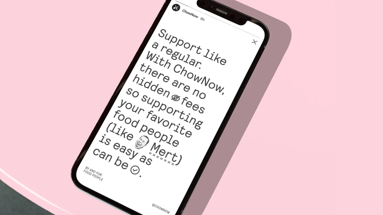
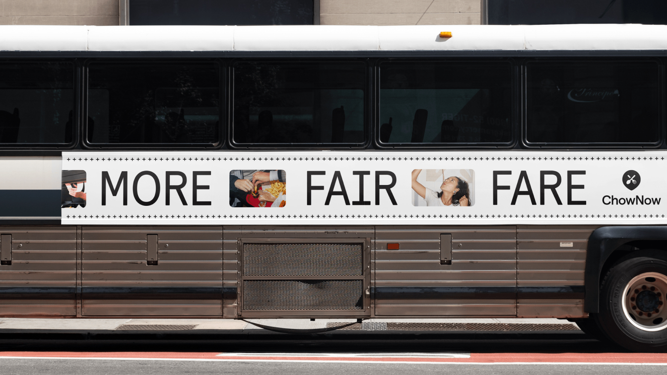
our differentiator: being good
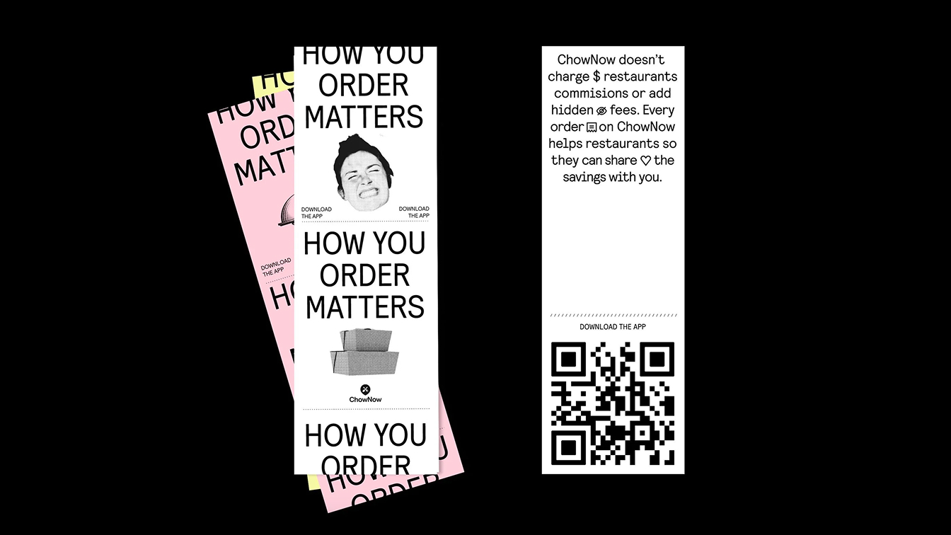
Our challenge was to highlight the thing that makes the company truly unique among the competition: ethics. While other services were charging high premiums and fees on every order, resulting in a net loss to restaurants, ChowNow stood out by charging a monthly subscription that doesn’t harm the restaurant’s bottom line.
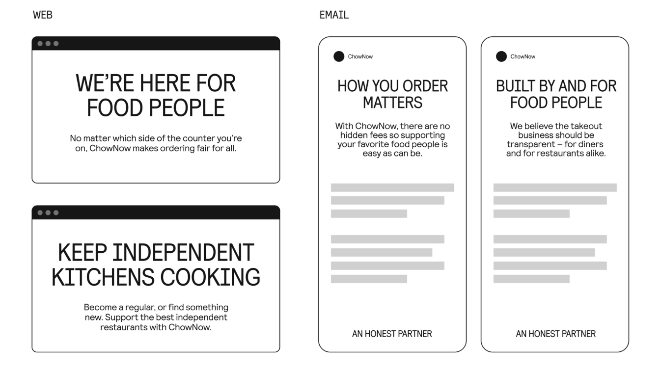
So, who are food people? They’re passionate about local traditions, opinionated about the best burger in town, curious about ingredients and how a dish comes together. They’re cooks and eaters who inhabit small town diners and explore East LA hot spots; order pizza in Minneapolis and bring their kids to farmers markets to learn about good food. To them, and to ChowNow who was built by food people, good food matters because a good meal goes beyond the flavors on the plate.

awards:
awards:
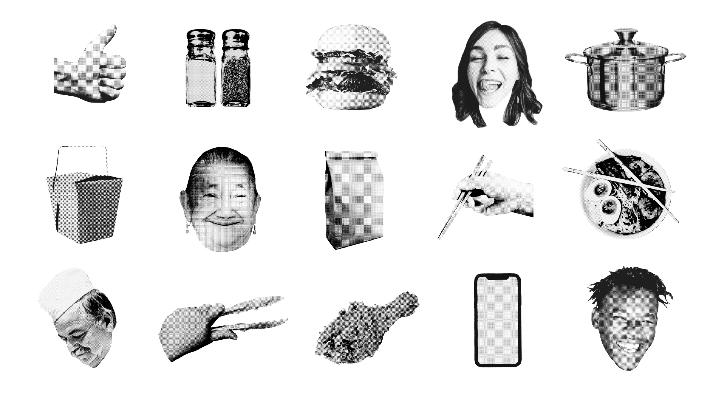
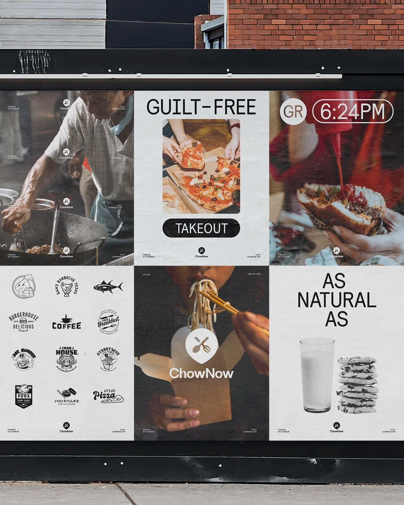
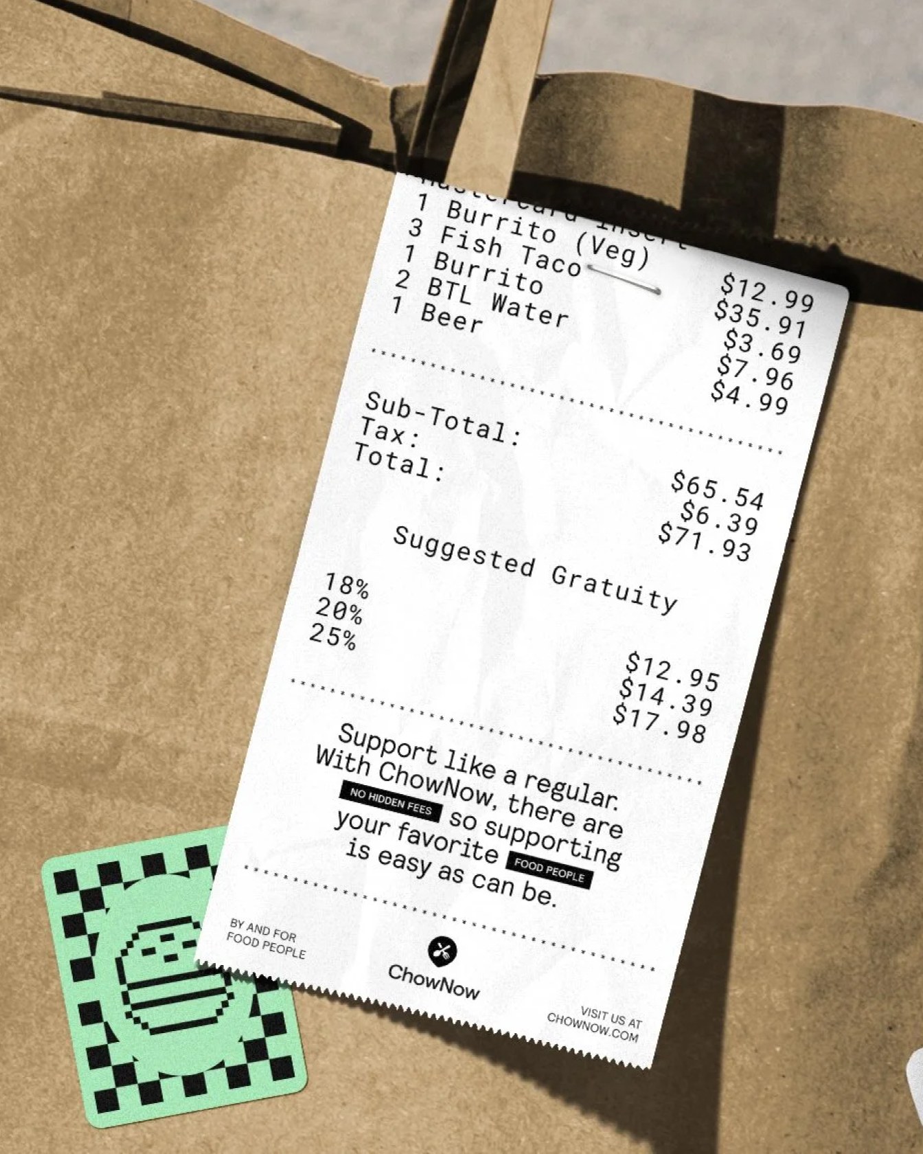
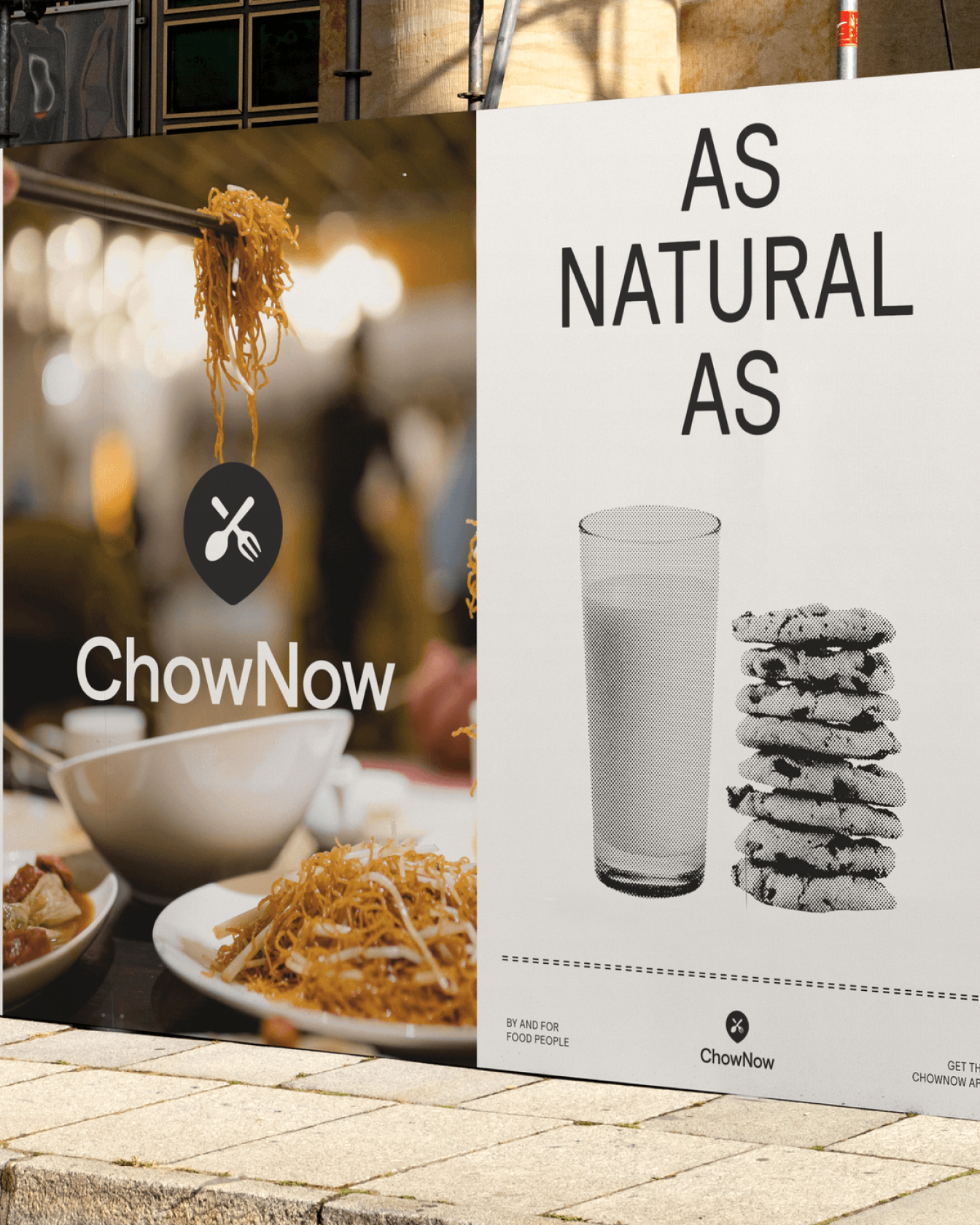
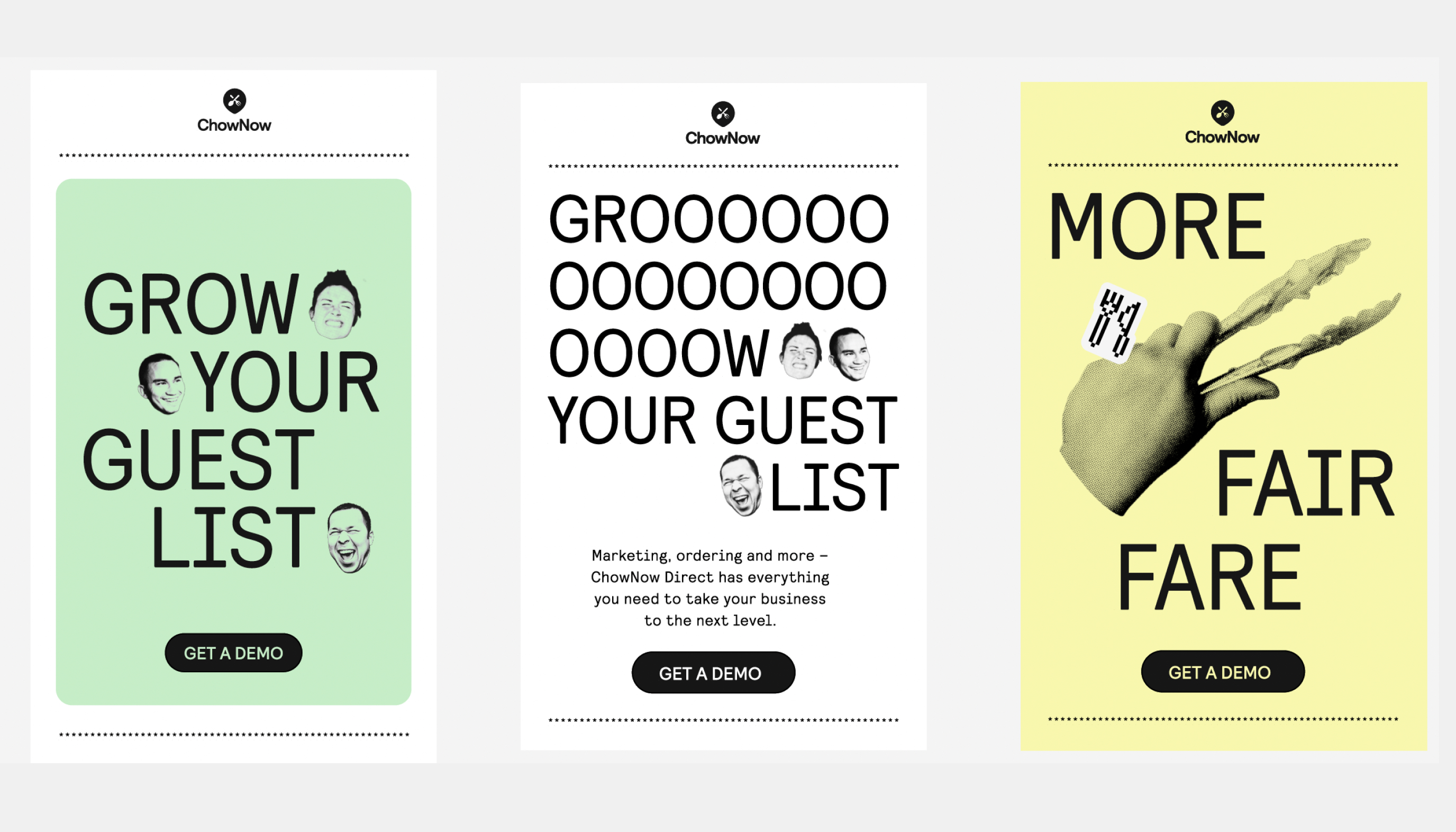
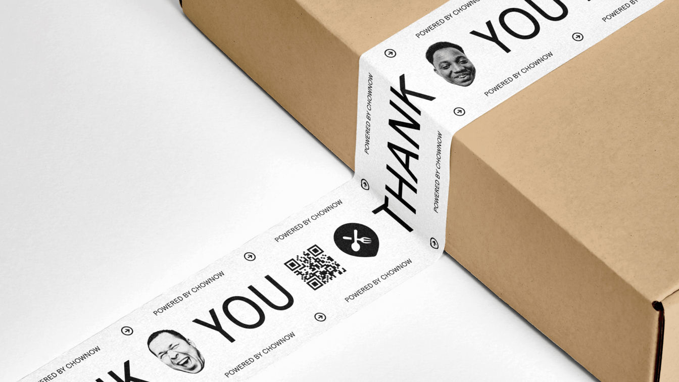
Our inspo: takeout menus and receipts
During our research phase we got to speak with many of ChowNow’s customers to understand the competitive landscape and what drew them to the service. One of the things that stood out to us is that most of these customers were mom-and-pop shops that needed help ‘going online’.
That inspired us to look at the colors and shapes that surround their restaurants and kitchens. We were drawn to their meal tickets and receipts in particular, and how design is informed through black and white type and ASCII symbols.
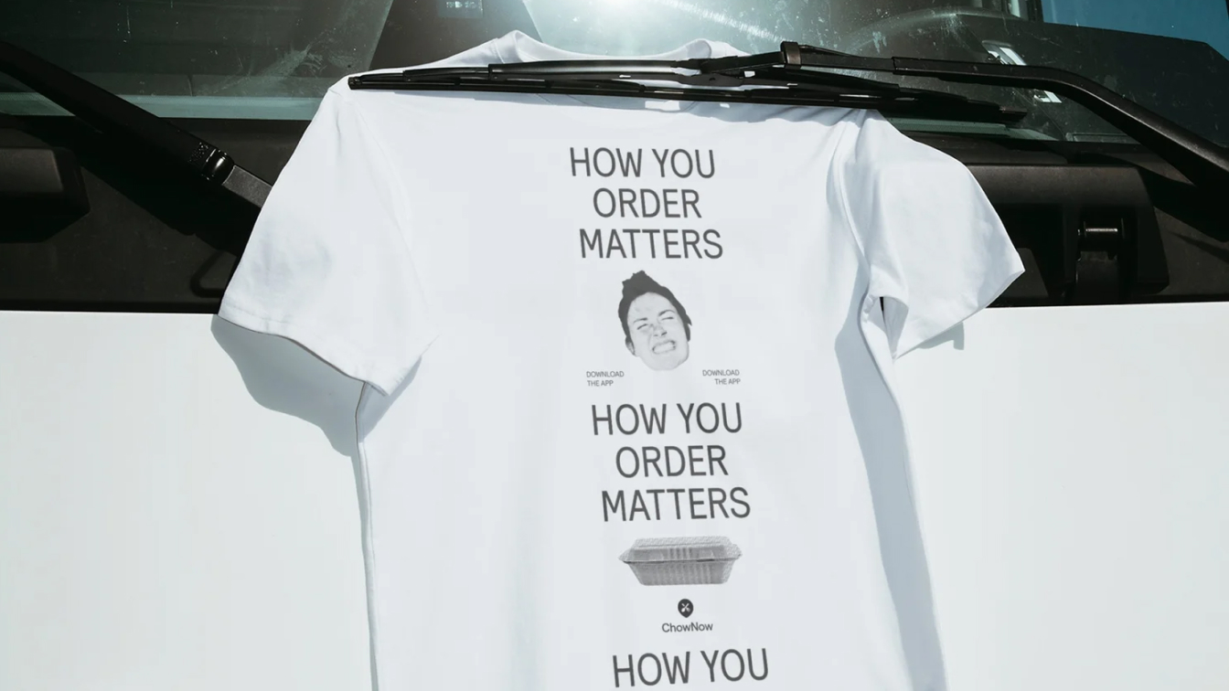

The True Partner
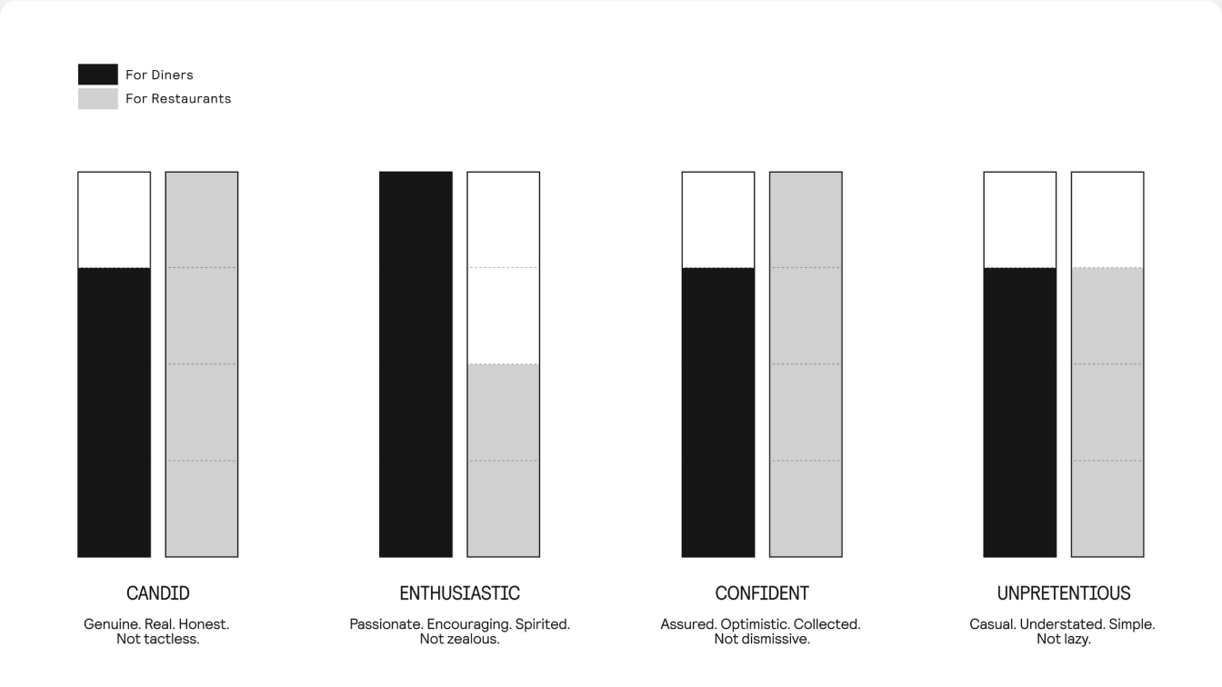
In a world that too often obscures the real message, ChowNow’s tone of voice aims to be a refreshing breath of fresh, clear air. Straightforward but friendly, plain-spoken but empathetic, ChowNow is able to deliver what matters in ways that help everyone understand and act – diners and restaurants alike.
Our objective is to deliver important, value-driven messaging to the audiences that need to hear it – in ways they’ll want to hear it. That means being more optimistic and engaging with diners; clear and assured with restaurants.
see more


Lorem ipsum dolor sit amet, consectetur adipiscing elit. Suspendisse varius enim in eros elementum tristique. Duis cursus, mi quis viverra ornare, eros dolor interdum nulla, ut commodo diam libero vitae erat. Aenean faucibus nibh et justo cursus id rutrum lorem imperdiet. Nunc ut sem vitae risus tristique posuere.