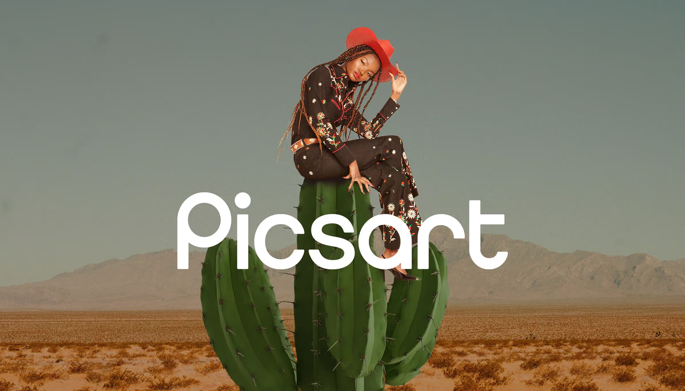

The simple joy of design
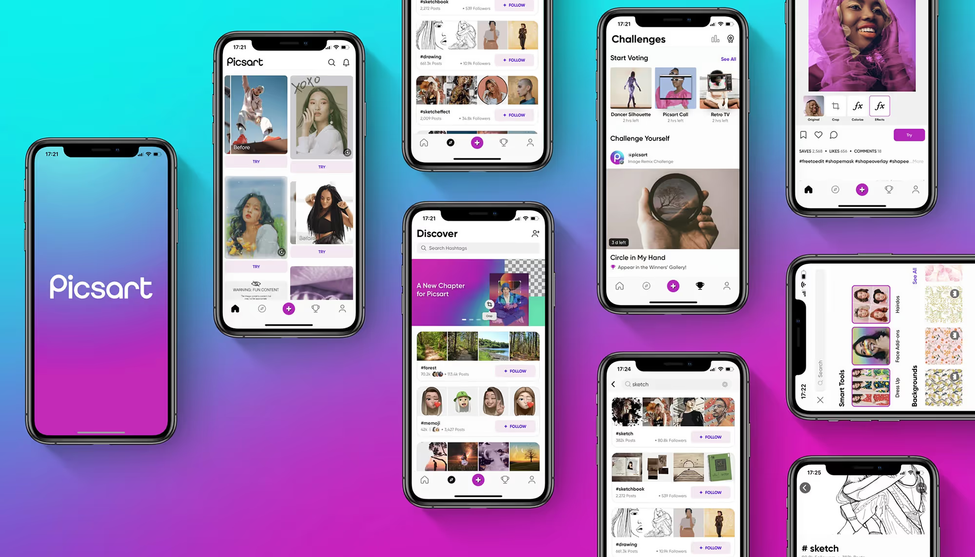
Picsart started as a place to edit a selfie. It became something bigger: where a hobbyist designs a logo, a small business owner builds a storefront, a creator ships an album cover. The product had become a full creative platform. The brand was still introducing the old one.
focus:
collaborators:
impact:
featured in:


What Picsart was really for
Design can feel intimidating for people who are starting out. The tools are expensive, complicated, and typically built for professionals, which quietly tells everyone else it isn't for them. Picsart had spent years proving the opposite, and that was the truth the brand wasn't carrying yet.
Once we named it, every other decision had somewhere to point: make design feel within reach, and make creating feel like a joy instead of a test.
awards:

awards:
A frame for everything
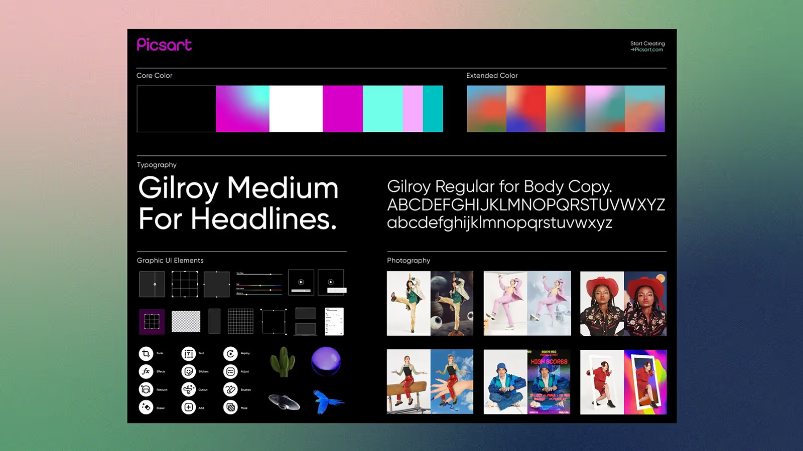
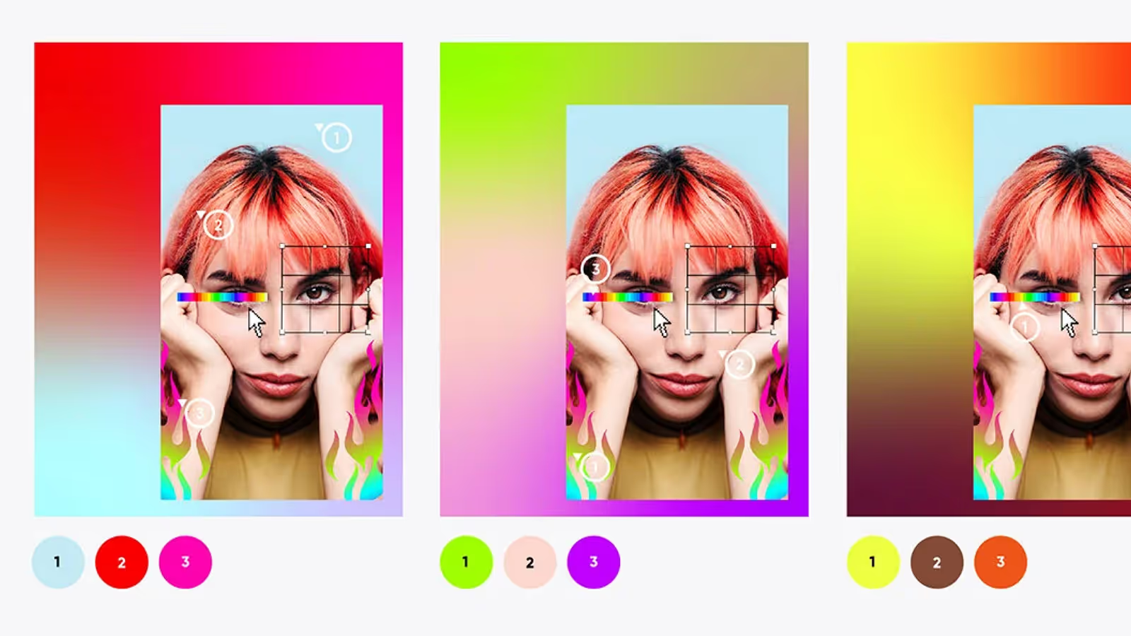
The challenge was holding millions of wildly different styles in one look that stays instantly recognizable. The breakthrough came from outside tech entirely. Museums face the same tension, different artists and work in one coherent space, held together by the frame.
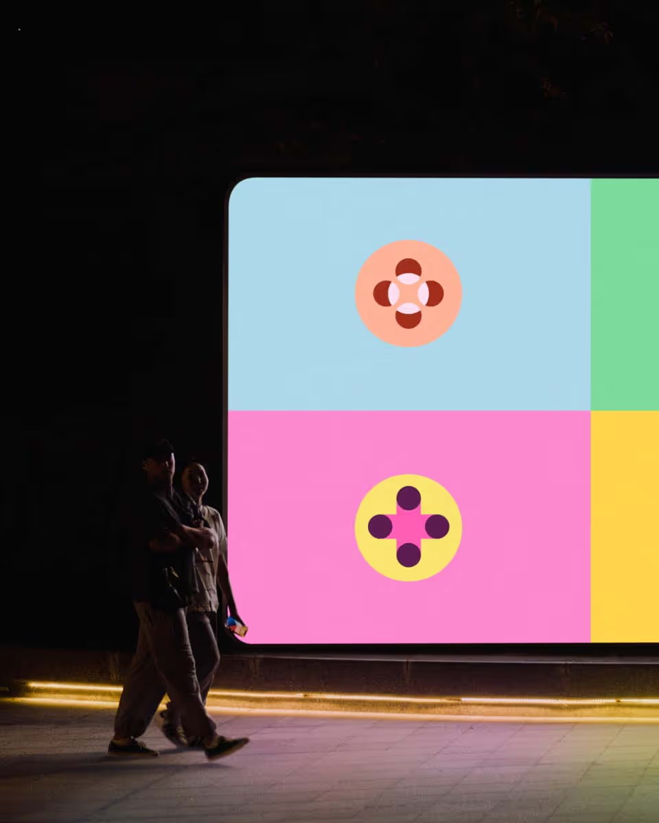
We built Picsart a frame of its own: a gradient drawn from three colors inside each creation we feature. The art stays wild. The brand stays whole.
.gif)






Winnie Wong

Photography as a Canvas
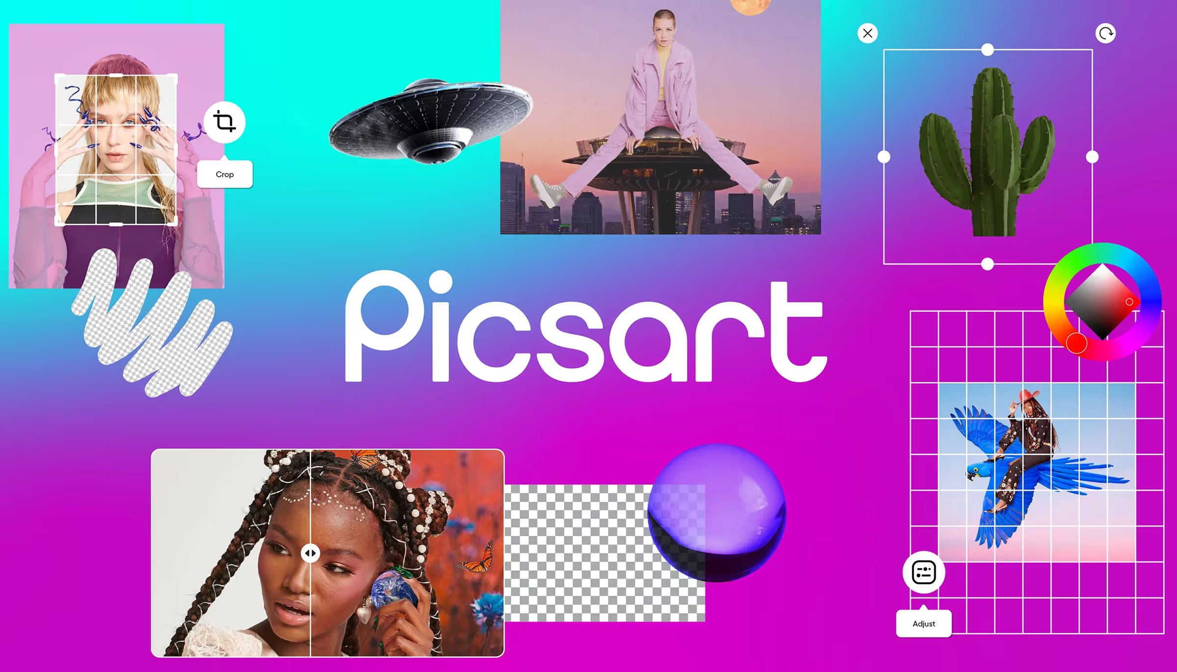
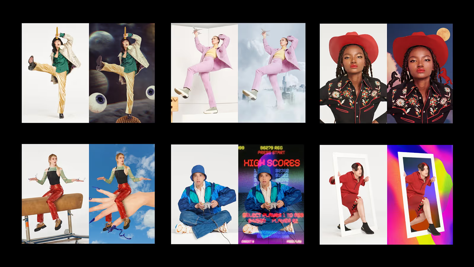
We studied how people actually use Picsart and noticed something. Almost no one starts from a blank canvas. They start from a photo. So we built the brand the way the community builds, from a library of real imagery rather than design in the abstract and hope it fit.
The ‘Rebel Art Teacher’
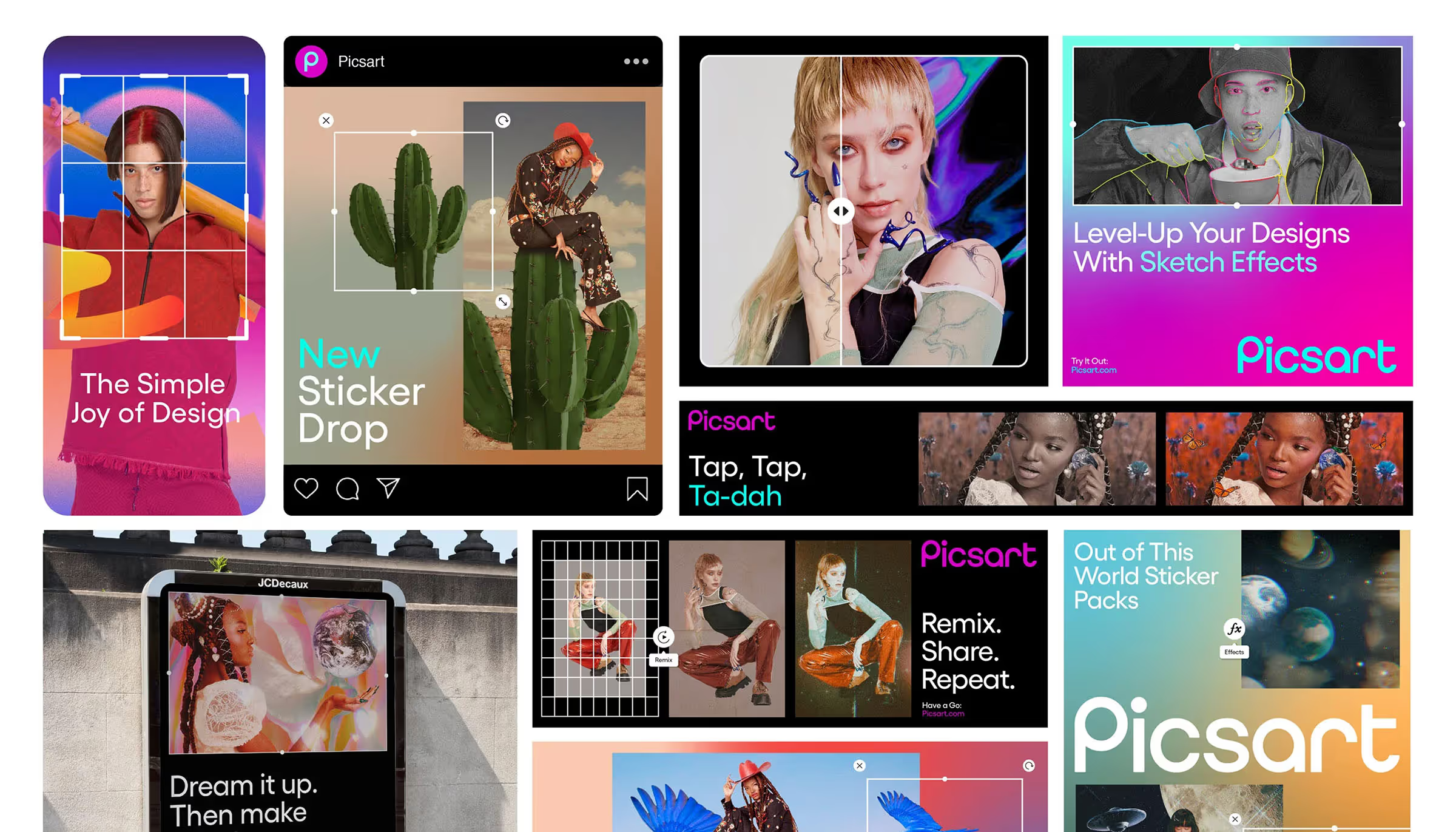
People don't come to Picsart to use software. They come to make something they couldn't make before. That's a real transformation, and it asks for a guide more than a toolbar. So we gave the brand a voice: an art teacher with a rebellious streak. A mentor and a misfit who sees what you could make and pushes you toward it.

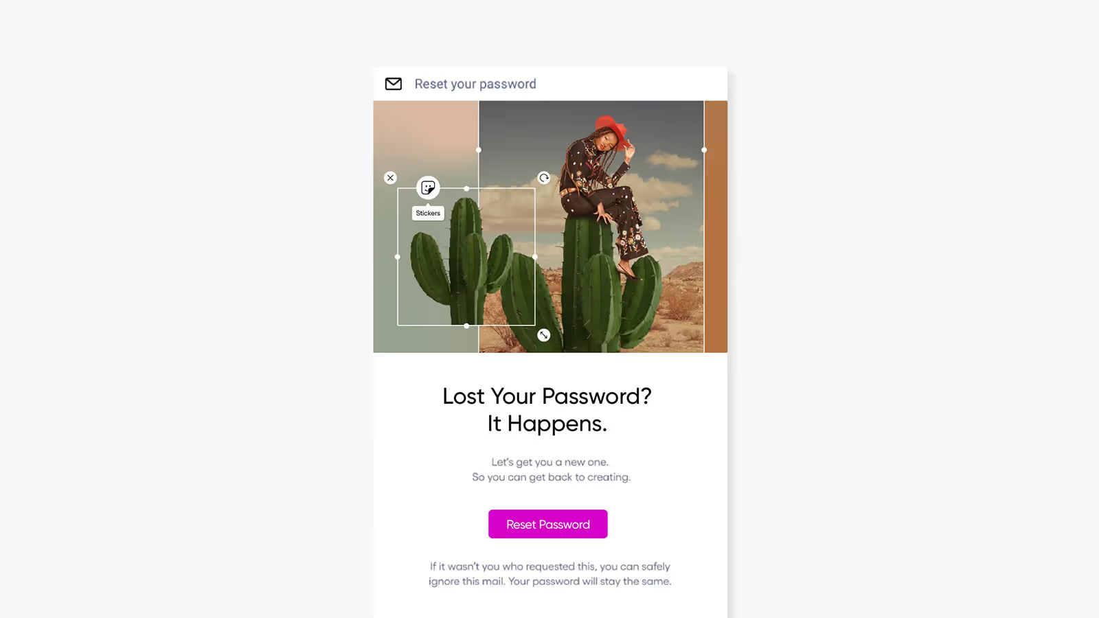

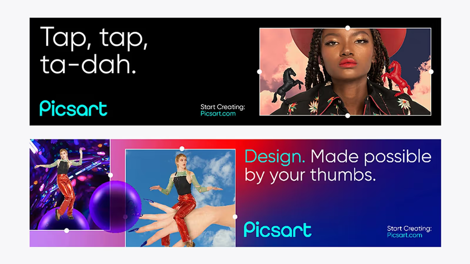
Going Beyond The ‘Silicon Valley Look’
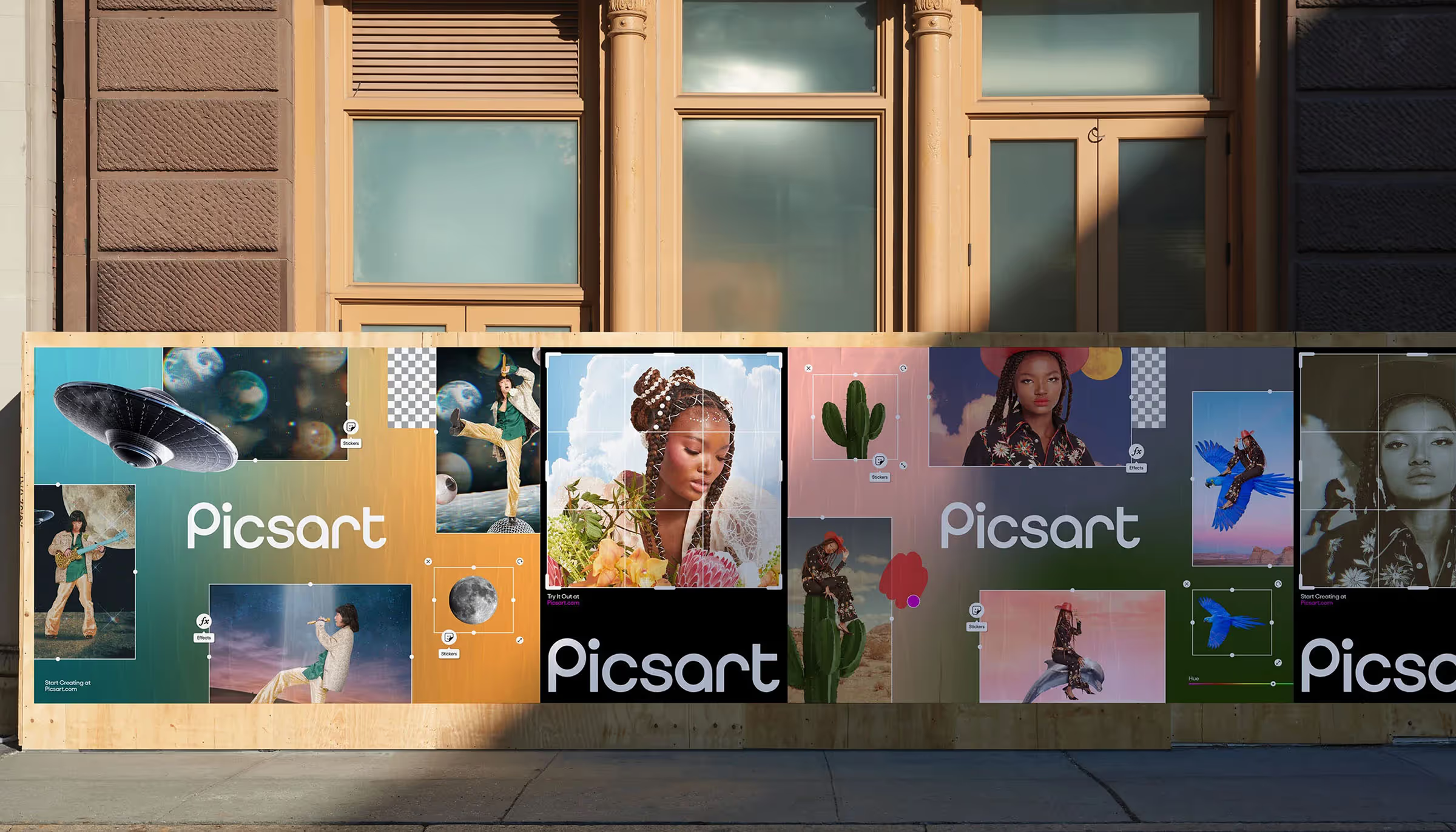
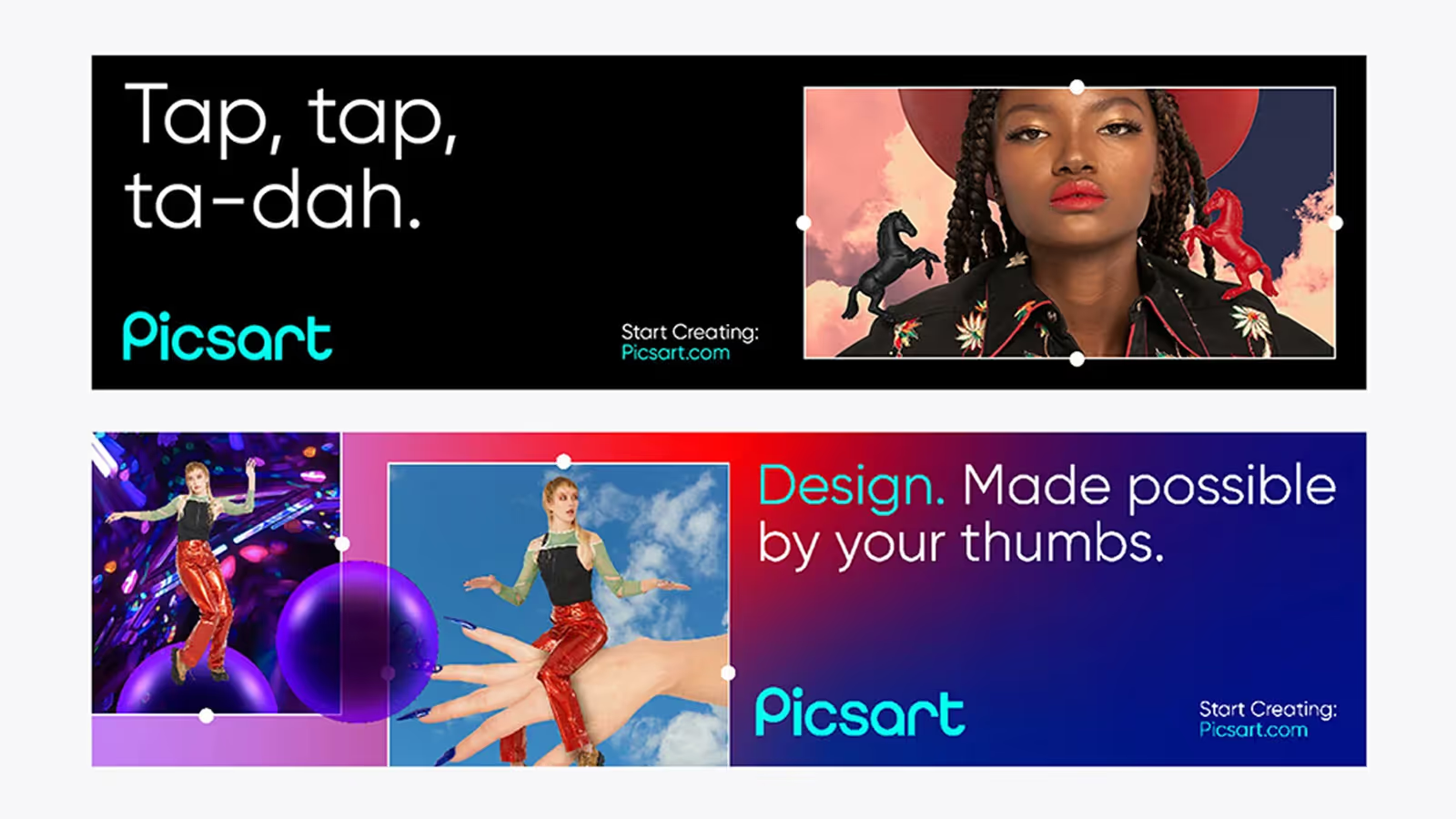
Most Picsart creators live outside North America, so a global point of view was the starting point, not an afterthought. Red reads differently in Spain than in China. We worked with country managers to tune the design market by market, rather than ship one Silicon Valley look everywhere.



see more






Lorem ipsum dolor sit amet, consectetur adipiscing elit. Suspendisse varius enim in eros elementum tristique. Duis cursus, mi quis viverra ornare, eros dolor interdum nulla, ut commodo diam libero vitae erat. Aenean faucibus nibh et justo cursus id rutrum lorem imperdiet. Nunc ut sem vitae risus tristique posuere.