
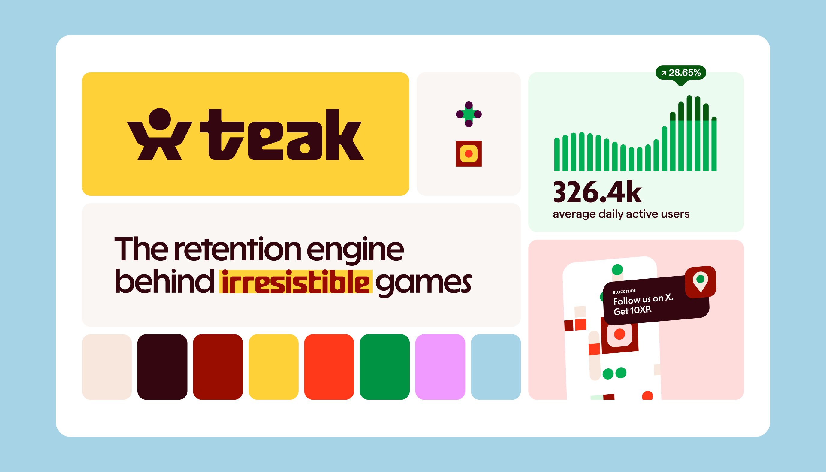
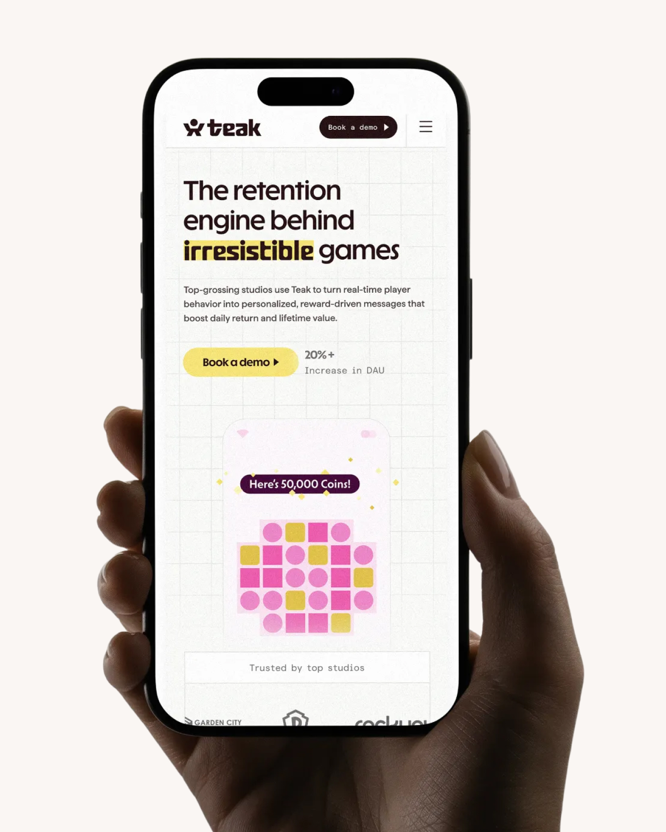
Teak, finally sounding like itself
When we started working with Teak, the challenge was not fixing a broken product. It was helping a great one finally sound like itself. Teak had spent years quietly becoming one of the most trusted retention platforms in free-to-play gaming, but its brand and website had not caught up to that reality.
The goal of this project was to close that gap. To clarify what Teak is, who it is for, and why it exists, without turning it into something louder, broader, or less honest than it needed to be. Along the way, we partnered with Work is Play, collaborating across strategy, brand, and web to rethink Teak’s positioning, visual language, and voice.
focus:
collaborators:
WORK IS PLAY - brand & web
impact:
featured in:

mobile games are not a side quest
In free-to-play gaming, most teams already know the big names. Platforms like Braze show up early in the consideration set because they look polished, powerful, and familiar. And to be fair, they are. Just not for this job.
For most large CRM platforms, mobile gaming is a side quest. A vertical that gets a handful of features, some surface-level support, and then gets lumped in with ecommerce and fintech when priorities are set. That works fine if games are a small part of what you do. It breaks down quickly if games are everything.
Teak’s strategy was to stop competing on perceived scale and start competing on relevance. Instead of trying to look like a universal solution, we leaned into the fact that Teak is unapologetically narrow. It is built for teams who live and die by daily engagement, who send multiple messages a day, who rely on incentives as part of the core experience, and who cannot afford tools that only half-understand their world.

awards:
awards:
we’re not for gamers
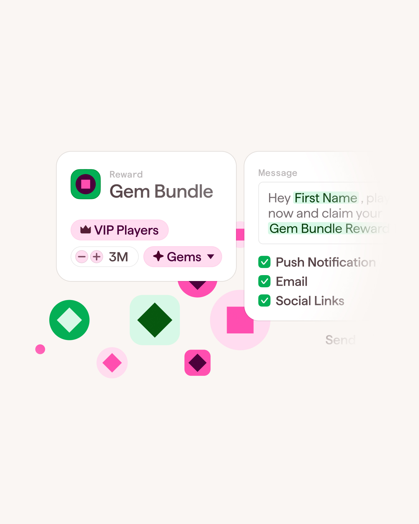
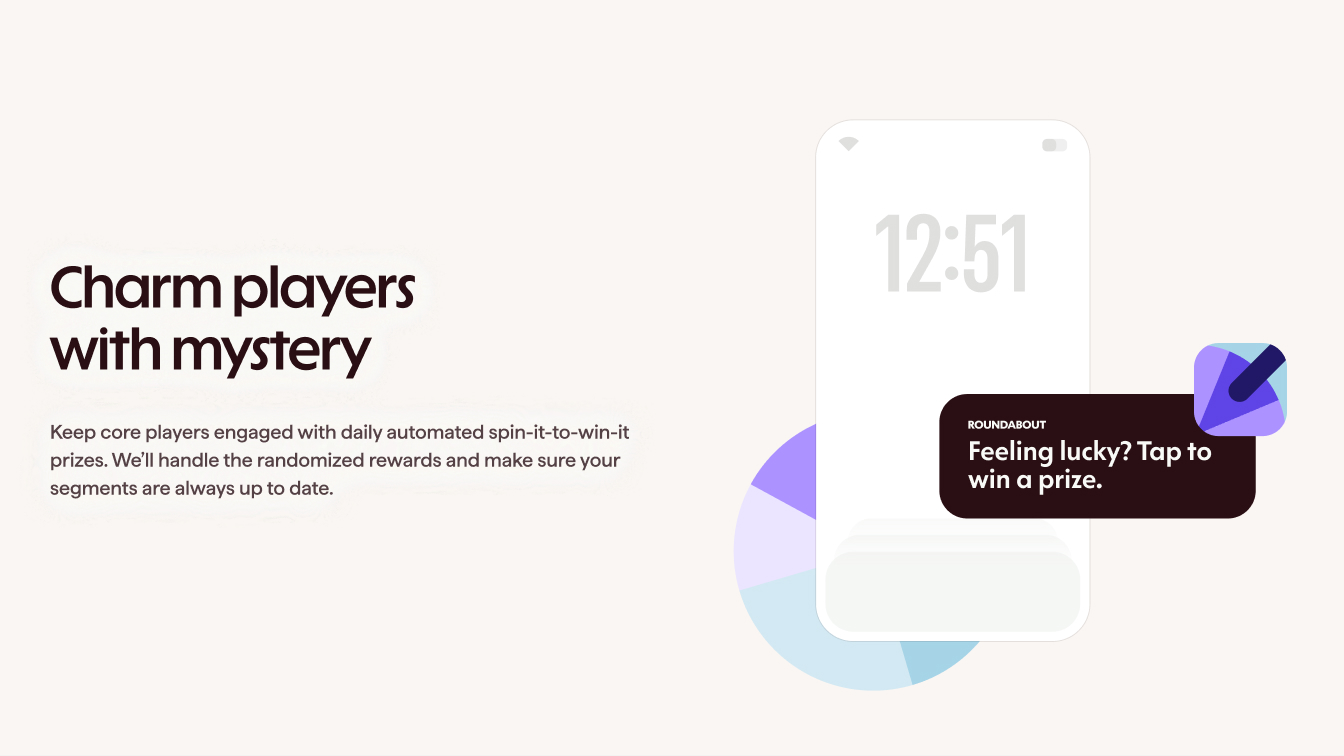
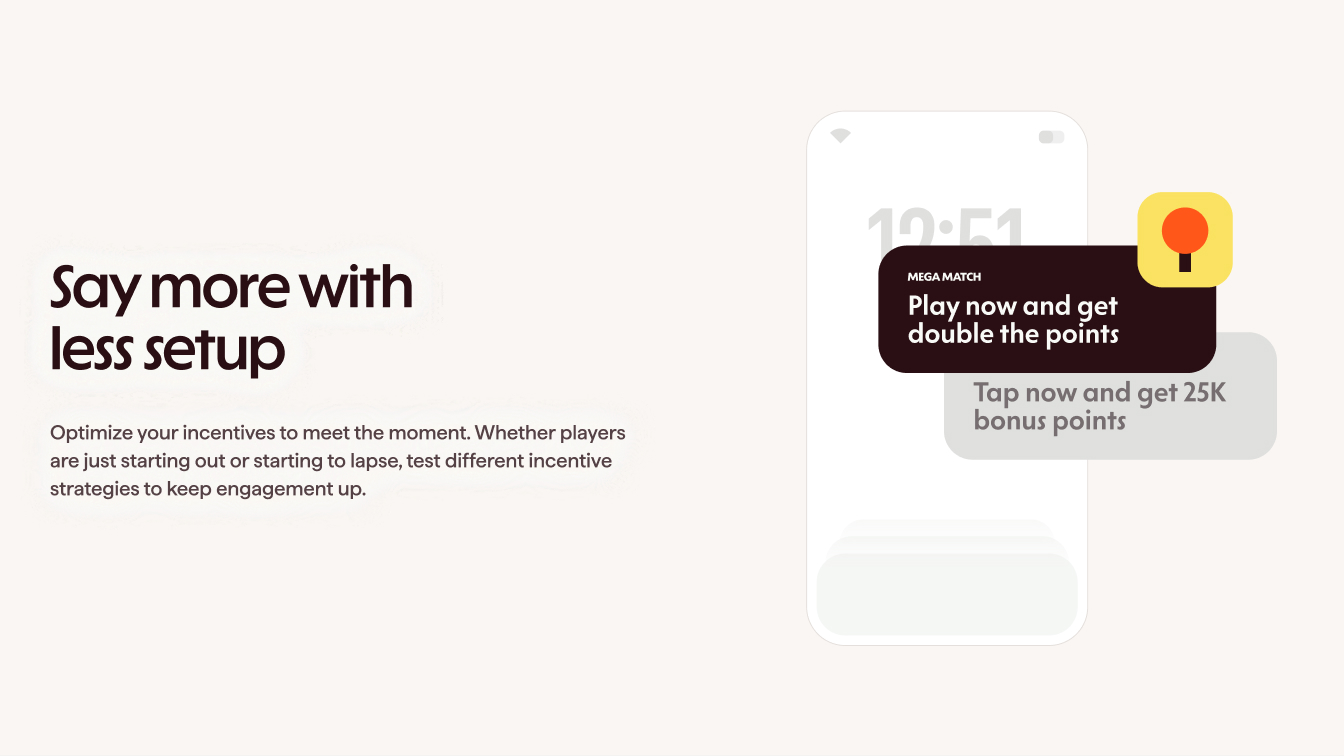
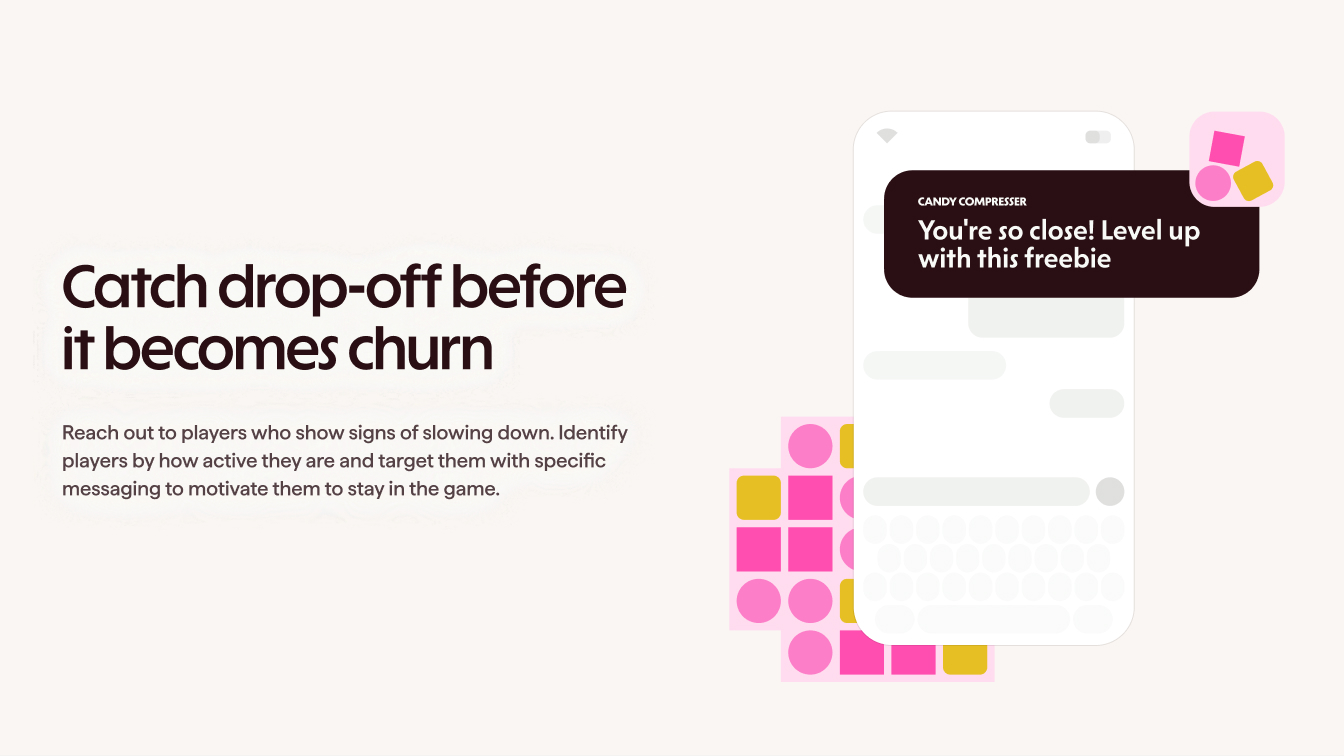
From the start, the design challenge was about balance. Teak lives deep inside the mobile gaming ecosystem, but it is not for players. It is for operators. The people running live ops, retention, and monetization day in and day out. That meant the visual language needed to acknowledge the world of games without borrowing the parts that belong to consumers.
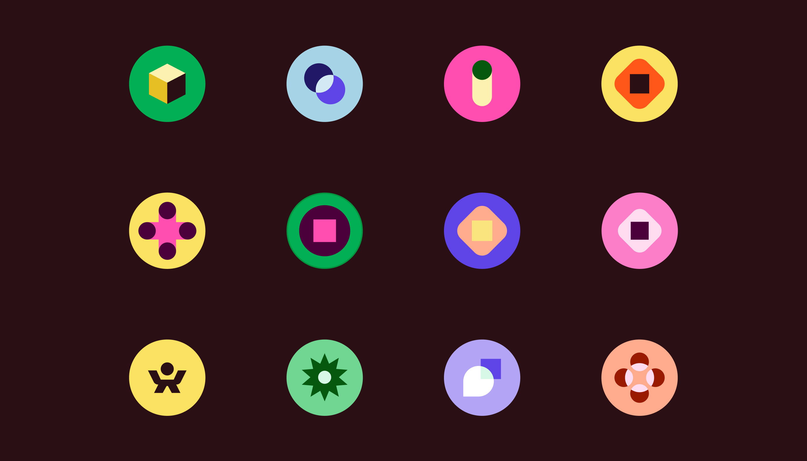
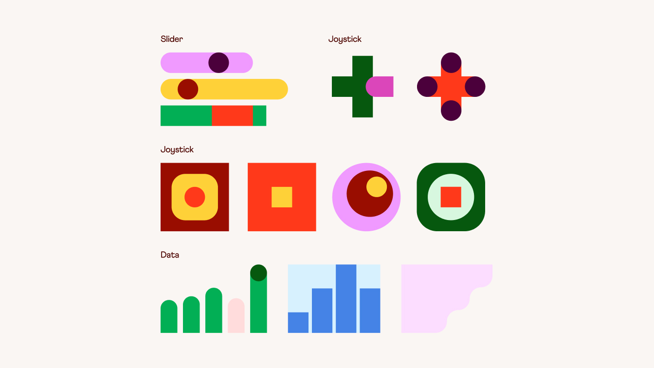
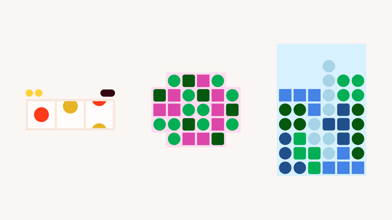
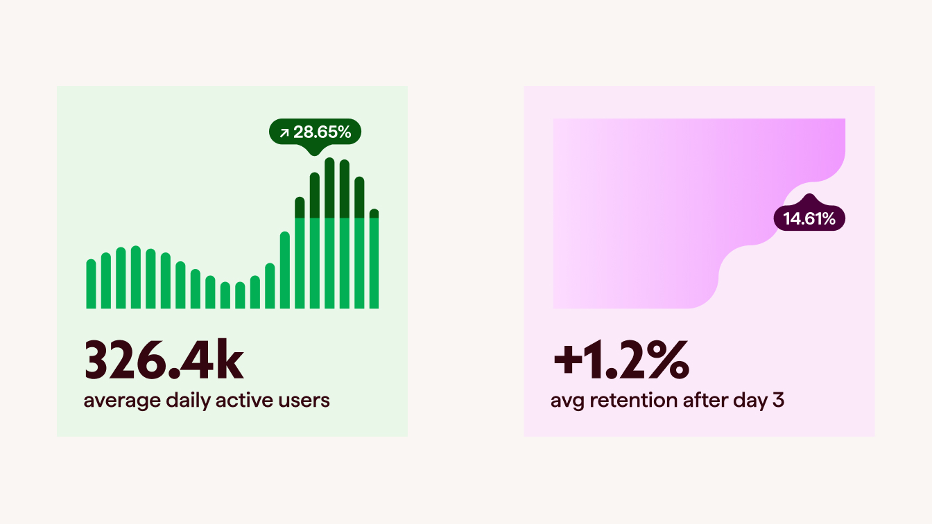
The solution was to tip our hat to gaming through structure, motion, and systems thinking rather than characters, genres, or overt references. We pulled from the rhythms of live games, progression, momentum, and feedback loops, while keeping everything grounded in a clean, professional interface that feels at home in a workday, not a loading screen. The result is a design that quietly signals, “We get this industry,” without ever trying to look like the product itself is a game.
Alex Scarborough
Written by people who get the job
The messaging approach was rooted in respect for the audience. Teak’s buyers are experienced operators who do not need hype or sweeping promises. They need clarity, relevance, and proof that the product understands their day-to-day reality.
We focused on plainspoken language, grounded confidence, and earned authority, favoring education over persuasion and specificity over buzzwords. The tone stays friendly and human without becoming casual, and confident without becoming salesy. Instead of trying to impress, the copy aims to feel familiar. Like it was written by someone who has done this job before and knows exactly where the friction lives.

see more


Lorem ipsum dolor sit amet, consectetur adipiscing elit. Suspendisse varius enim in eros elementum tristique. Duis cursus, mi quis viverra ornare, eros dolor interdum nulla, ut commodo diam libero vitae erat. Aenean faucibus nibh et justo cursus id rutrum lorem imperdiet. Nunc ut sem vitae risus tristique posuere.